An Post —
Track & Trace
Redesigning a high-traffic delivery tracking system to make complex, uncertain states clear and actionable.
Heavily used. Poorly communicating.
Track & Trace was one of the most important parts of An Post's digital experience. Millions of users relied on it across web and native platforms to answer a simple but high-stakes question: Where is my parcel?
The feature was heavily used, but underperforming. The issue was not that the system lacked information. It was that the experience did a poor job of communicating meaning. Users were presented with fragmented updates, inconsistent statuses, and weak visual hierarchy. In moments where they were most anxious — delays, customs issues, failed delivery attempts — the experience gave them little clarity and even less direction.
This had a direct business impact. Support teams were handling avoidable queries driven not by operational failure, but by interaction failure. People were contacting An Post because the product wasn't helping them understand what was happening or what to do next.
The system exposed information. It didn't communicate meaning.
The existing Track & Trace experience exposed information, but it did not communicate system state clearly enough for users to act with confidence.
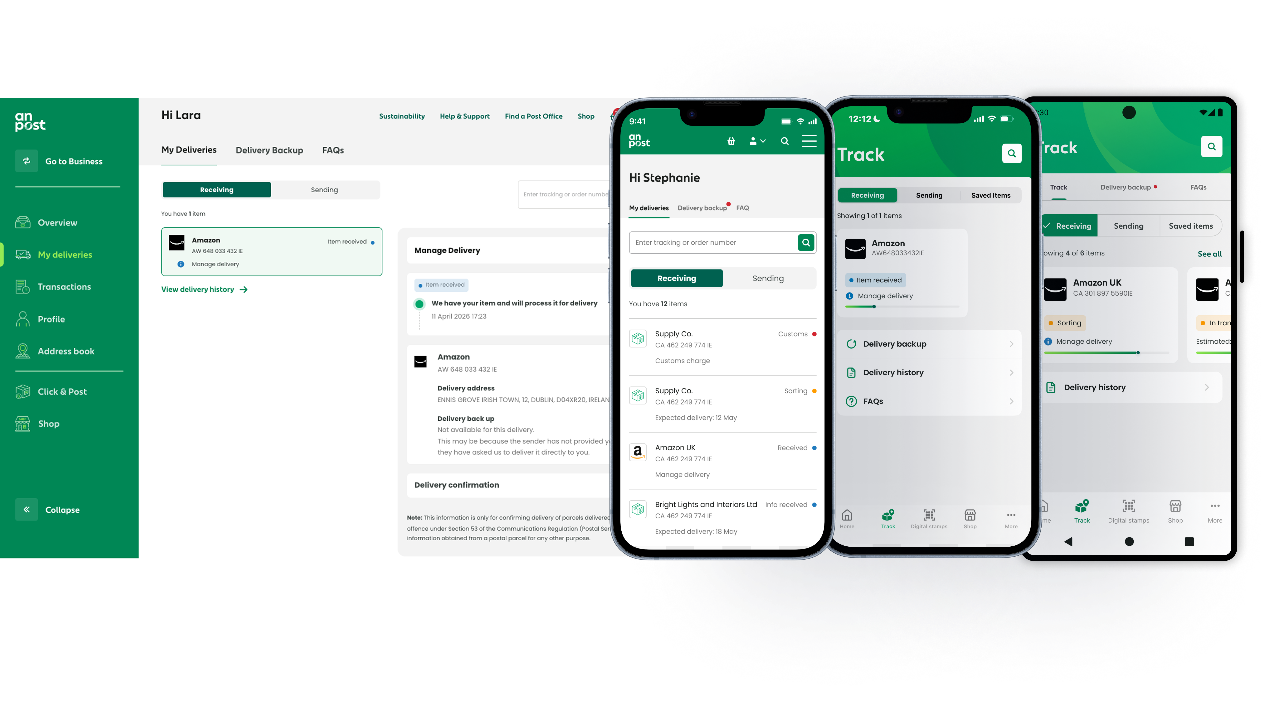
Statuses were surfaced too literally. Internal logistics updates appeared as raw or loosely translated delivery codes, with no clear structure for how users should interpret them. The difference between a parcel making normal progress and a parcel stalled in customs was not communicated with enough clarity. Supporting detail often had the same visual weight as primary information, forcing users to scan and interpret instead of understand at a glance.
The biggest issues appeared in edge cases. Customs processing, delivery exceptions, and failed delivery states were either inconsistently designed or dropped into secondary flows that lacked continuity. Some critical paths pushed users out of the native app into webviews, breaking the experience at exactly the point where the user needed reassurance and clear next steps.
The design challenge was not simply to tidy up the interface. It was to rethink how the product communicated parcel state across normal and exceptional conditions.
Lead Product Designer
I led the redesign of Track & Trace across web and native platforms, from problem framing through to solution design and delivery.
My role covered information architecture, interaction design, status modelling, edge-case flows, and the design of key native experiences. I worked closely with product, engineering, and logistics stakeholders to align the user-facing experience with the underlying delivery data. I also helped widen the scope of the project — the original brief leaned more towards visual improvement, but research and analysis made it clear that the real issue sat deeper in the structure and logic of the experience.
Five decisions that changed the experience
1 — Redefining delivery statuses around user meaning
The first major decision was to stop designing around backend delivery codes and instead define a clear delivery status model for users. I introduced a smaller set of structured, human-readable states — including Delivered, Out for delivery, Customs, and Delivery issue / not delivered. Each state was designed to answer three questions clearly: what is happening right now, what does this mean for my parcel, and do I need to do anything next. This created a more coherent experience and reduced the burden on users to interpret operational language for themselves.
2 — Rebuilding the hierarchy around the primary signal
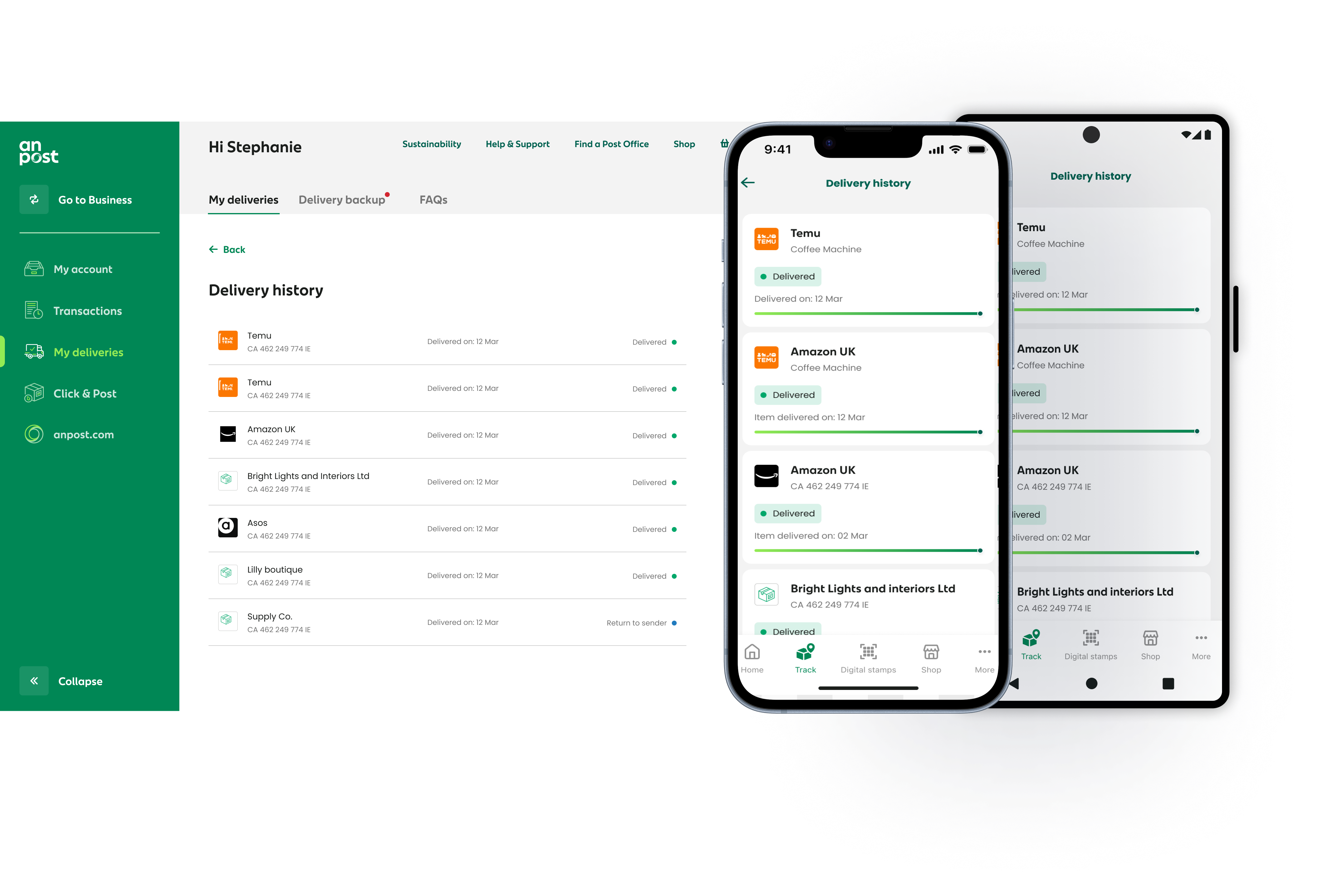
In the old experience, timestamps, scan updates, and secondary information often competed visually with the core status. The redesigned screen was built around one dominant signal: the parcel's current state. Everything else supported that. The top of the screen answered the user's immediate question first, while timeline detail, location history, and supporting information sat below in a secondary layer. Instead of reading through a list of updates and trying to infer meaning, users could immediately understand where things stood.
3 — Designing edge cases as complete flows
One of the highest-value parts of the redesign was treating edge cases as first-class product scenarios rather than exceptions. Customs was a strong example — parcels in customs often triggered the most confusion, partly because the existing experience surfaced unclear language and partly because associated actions lived in fragmented flows. I redesigned customs handling as a clearer, more guided journey: making the status legible, clarifying what stage the parcel was in, and keeping actions within the native experience. The same principle was applied to delayed deliveries, failed delivery attempts, and collection-related states.
4 — Native-first for critical journeys
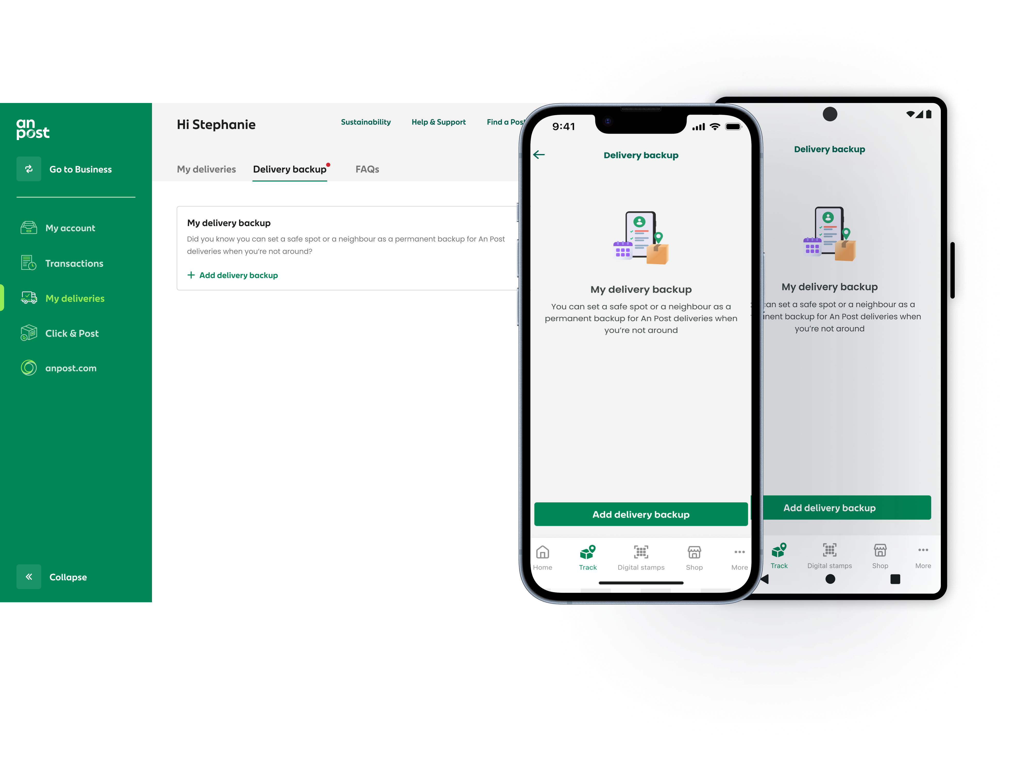
In the native app, key journeys had been broken by webviews — most problematically in customs and collection flows, where users were moved out of the main app to complete actions. I redesigned these journeys as inline native experiences so that users could complete critical actions without losing context. This improved continuity, reduced friction, and made the overall product feel more coherent and reliable.
5 — Progressive disclosure for unavoidable complexity
Some delivery states naturally required more detail than others. Customs documentation, redelivery options, and collection information all needed supporting content, but surfacing everything at once would have overwhelmed the interface. The primary screen communicated the essential status and any required action, with deeper operational detail available only when needed. This kept the experience simple on first view while still supporting more complex needs.
States that behaved, not just looked right
A large part of the value in this redesign came from how states behaved, not just how they looked. Each status combined a visual signal with plain-language meaning — users could quickly distinguish between routine progress and an exception state without needing to interpret raw data.
The interface was designed to answer the first question quickly and the second question naturally. First: what's happening now? Then: what happened before, and what comes next?
Where action was needed, the interaction made that explicit. Where no action was needed, the experience reduced anxiety by making that equally clear.
Measurable improvement across usage and support
Usage of Track & Trace increased by 33% after launch, suggesting users were more willing to rely on the product as part of their delivery journey. Support complaints related to tracking confusion fell by 10%, indicating that the redesigned status model and clearer edge-case handling reduced avoidable contact. Account sign-ups increased by 6% — not because sign-up was aggressively pushed, but because the product made the value of a signed-in experience more visible at the right moments.
Qualitatively, the biggest improvement was confidence. Post-launch feedback showed that users better understood what was happening with their parcel and what, if anything, they needed to do next.
What I learned
The most important design decision on this project happened before any screens were finalised: defining the delivery status model itself. Once the structure and meaning were right, the interface became much easier to design well.
If I were improving the project further, I would have brought the logistics data team into a more structured collaboration earlier in the process. The handoff between operational data and user-facing language took longer than it should have, and tighter alignment earlier would have reduced some late-stage iteration.
What this project reinforced for me is that clarity in complex systems is rarely just a visual design problem. Often the real work is defining the right model underneath, then designing the interaction so that model becomes obvious in use.