An Post —
Accessible Form Fields
Rebuilding form components so accessibility, interaction clarity, and system feedback were built into the design system by default.
High-leverage work at the component level
Form fields are among the most-used interactive components in any digital product. They are also one of the most common places for accessibility and usability issues to accumulate quietly over time.
As part of my work on the An Post design system, I conducted an audit of the existing form component library against WCAG AA criteria. The result was consistent: every component had at least one issue. None were catastrophic in isolation, but together they created a form experience that was harder to use, less predictable, and more error-prone than it should have been.
Because these patterns lived in the design system, every screen built with them inherited the same problems. That made this a high-leverage piece of work. Fixing accessibility and interaction issues at component level would improve every product surface that used them.
Issues across both visual design and behaviour
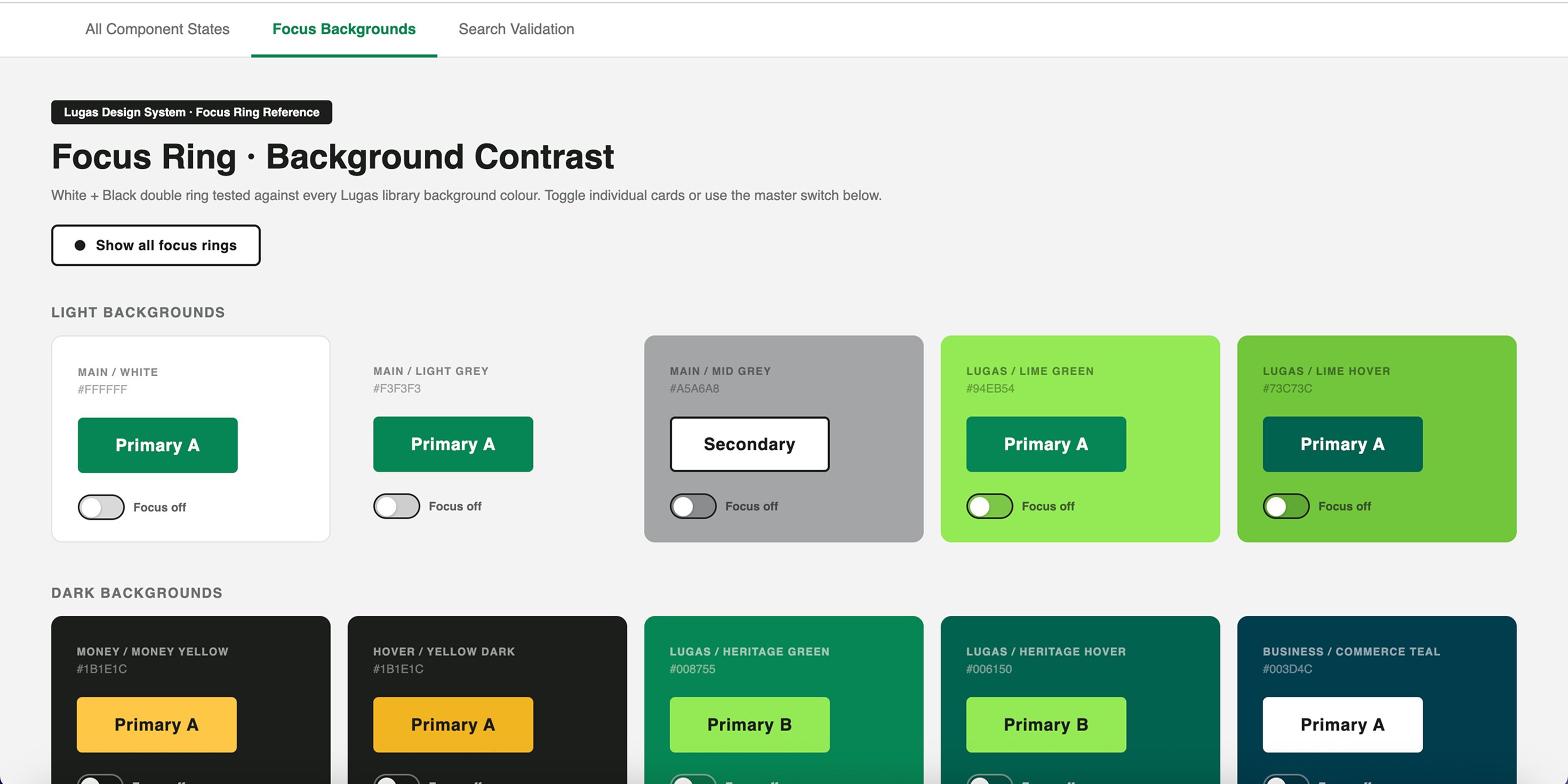
Labels were sometimes missing or replaced by placeholder text. Focus rings were too faint to function as reliable system feedback. Error states often relied on colour alone, which made them less accessible and less clear. Some touch targets fell below minimum size expectations on mobile. Disabled states reduced contrast so much that controls became difficult to perceive.
Individually, each of these details could be missed. Collectively, they made core interactions feel less dependable and excluded users who relied on stronger visual cues, keyboard navigation, or assistive technology.
Lead Product Designer
I led the audit, the redesign of the components, and the documentation that made those changes usable in practice. That meant not only defining better visual and interaction behaviour, but also translating accessibility requirements into concrete, repeatable specifications that designers and developers could work with confidently.
I also used Claude as a working tool during the process — for accessibility research, first-draft documentation, and error-copy generation — supporting speed while maintaining design judgement and quality. This use of AI as part of the design workflow also reflects how I increasingly work across product design problems.
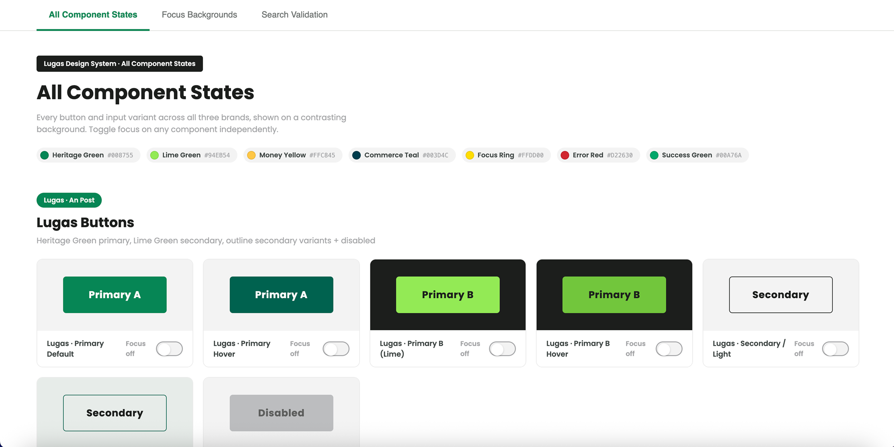
Components redesigned as complete interaction models
1 — Redesigning components across all key states
Each component was redesigned not as a static object, but as a complete interaction model — defining behaviour and presentation across default, focus, error, success where relevant, and disabled states. The goal was consistency and predictability: users should be able to recognise the component's state instantly and understand what the system expected of them.
2 — Making labels and instructions persistent
One of the highest-impact decisions was to make labels always visible. Placeholder text was retained only as supporting hint content, never as the primary label. This improved clarity for everyone, but particularly for users with memory, attention, or cognitive challenges.
3 — Designing error states as communication, not decoration
The new error standard combined structural, visual, and content changes. Errors included a clear icon, a written explanation, and where possible a specific correction path. This shifted the pattern from "something is wrong" to "here is what needs fixing and how."
4 — Using tokens and documentation to enforce the right defaults
Design tokens were used to encode accessible values for spacing, focus treatments, and contrast. This reduced the chance of designers unintentionally selecting inaccessible values. Documentation was then written for both designers and developers, covering visual spec, behaviour, ARIA guidance, and keyboard interaction.
Accessible and reliable by default
Focus states were made clearer and more visible so active elements were always easy to identify. Error states were designed to be understandable without relying on colour alone. Helper text and error text were differentiated clearly. Disabled behaviour retained enough contrast to remain legible without implying interactivity.
The overall goal was to make form interaction feel reliable, consistent, and accessible by default — not dependent on a designer remembering a checklist for each screen.
A stronger baseline, inherited automatically
All 12 form components were rebuilt to the updated standard and adopted across the product ecosystem. Post-adoption review showed zero accessibility regressions in newly built screens using the updated library. The documentation model created during this work also became a pattern for other components in the design system.
The real value of the work was cumulative. By improving the building blocks, every product team using them inherited a stronger baseline automatically.
What I learned
What worked best was addressing the issue at system level rather than fixing individual screens. Accessibility improvements compound when they live in shared components.
If I were improving the process, I would bring this kind of audit earlier into the lifecycle of the design system. Accessibility should not be a remediation exercise after patterns already exist; it should be part of the acceptance criteria from the start.
This project reinforced a belief I hold strongly: good design systems do more than create consistency. They make the right interaction more likely.