RBS —
eQ Mobile
Designing a mobile experience for high-stakes business banking, where trust, clarity, and decision confidence mattered more than speed alone.
Mobile banking built around decision quality, not feature parity
RBS's eQ platform was a desktop-first business banking product used by account managers and authorisers to review and approve payment batches. The opportunity was to extend that capability to mobile in a way that felt genuinely useful, without compromising the trust and control built into the desktop experience.
The challenge was not to recreate every desktop feature on a smaller screen. It was to identify what authorisers actually needed in order to make confident decisions on mobile, then design that experience carefully.
Balancing simplicity with decision quality
A direct desktop-to-mobile translation would not work. Desktop authorisation relied on dense information layouts, wide data tables, and a review process shaped by large-screen behaviour. Mobile demanded a different structure. At the same time, this was a high-risk domain — approving the wrong batch or acting without sufficient context could have serious financial consequences.
The design challenge was balancing simplicity with decision quality. The interface needed to become more focused without stripping away the information necessary for trust.
Lead Product Designer
I led the design of the eQ mobile experience from early scoping through to launch. My work covered interaction design, flow structure, onboarding, and the design of the core authorisation journey.
A key part of the role was defining scope. What mattered most on mobile was not feature breadth, but getting the core authorisation task right.
Four decisions that shaped the product
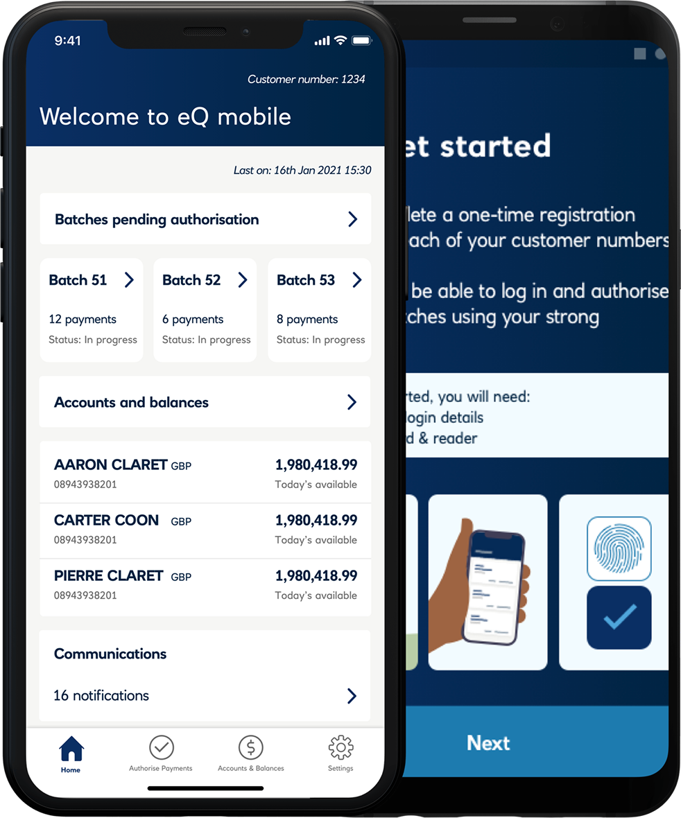
1 — Defining the minimum viable authorisation flow
The first decision was strategic but deeply tied to craft: identifying the smallest set of features that would make the app genuinely useful. The core mobile journey focused on batch list, batch detail, risk summary, authorise or reject, and confirmation. Rather than chasing desktop parity, the product was intentionally scoped to support the main decision path well.
2 — Surfacing risk before action
The batch detail screen was designed to foreground the information an authoriser needed before making a decision — including value, payee count, and risk-related signals such as unusual amounts or flagged transactions. The sequence mattered. The interface encouraged review before action, making the experience feel deliberate rather than merely efficient.
3 — Designing secure confirmation and authentication patterns
Authentication used biometrics where available, with PIN fallback. Confirmation screens clearly reflected what had been approved, when, and at what value. This provided both reassurance in the moment and a clearer sense of accountability for the action.
4 — Giving onboarding proper design attention
Mobile onboarding was a two-device flow, requiring users to pair the mobile app with an existing desktop account. This was a critical first impression of the product. I designed the onboarding flow to be highly structured, with one clear action per step and explicit confirmation before progression — helping users establish trust in the product before they reached the core functionality.
Supporting confident action, not rushed action
This project was shaped by the idea that mobile business banking should support confident action, not rushed action. Risk indicators were placed before approval controls so users could review context before acting. The interaction pattern required deliberate progression, reducing the chance of accidental approval while still supporting efficient use.
Confirmation states were explicit and designed to feel trustworthy, giving users a clear record of what had happened. The design reduced interface clutter without reducing decision-critical information.
A product that earned its place in real workflows
Following launch, 8,000 payment batches were approved through the mobile app. Engagement was 3× the projected baseline, and authoriser adoption increased by 5% during the initial rollout.
The adoption metric was particularly important. It showed that users were not simply trying the product once, but incorporating it into their actual workflow.
What I learned
What worked best was resisting the pressure to build too much. By narrowing the scope to the core authorisation journey, the mobile product became more useful and more coherent than a feature-parity version would have been.
If I were extending the work, I would look ahead at how risk signalling scales as more product functionality is introduced. The initial pattern worked well for launch, but future growth would require careful handling to avoid overwhelming the review experience.
The biggest lesson from this project was that simplification is not always about showing less. In high-stakes products, it is about showing the right information in the right order, so users can act with confidence.