Current Health —
Connected Health App
Designing a mobile health product that had to work safely for users with very different levels of digital confidence.
Clarity as a safety concern
Current Health is a remote patient monitoring platform that connects patients to wearable and home-use medical devices. The app allows health data to be collected outside clinical settings, making it possible for care teams to monitor patients without requiring them to attend in person.
The design challenge was unusually demanding. The product needed to work for users with a wide range of digital confidence — from people comfortable using connected technology to first-time smartphone owners. At the same time, the product had to communicate health information accurately and support safe device setup under real-world conditions that the team could not fully control.
This meant clarity was not just a usability concern. It was a safety concern.
Three difficult constraints at once
The product sat at the intersection of three difficult constraints. First, the user range was unusually broad — some patients moved through flows easily, others needed very explicit guidance and reassurance at every step. Second, device connection was complex by nature: pairing medical devices involved multiple steps, waiting states, possible failures, and recovery paths that users could actually follow. Third, much of the product's language came from clinical contexts — accurate wording mattered, but the interface could not assume users understood clinical terminology.
The core challenge was to design a product that remained clear, calm, and actionable across all of those conditions.
Lead Product Designer
I led the product design work for the app, covering interaction design, information architecture, and accessibility direction. I worked closely with clinical stakeholders, whose input materially shaped how health data, instructions, and error states were presented.
That collaboration was a key constraint in the work. Design decisions had to be both easy for patients to use and appropriate within a clinical product context.
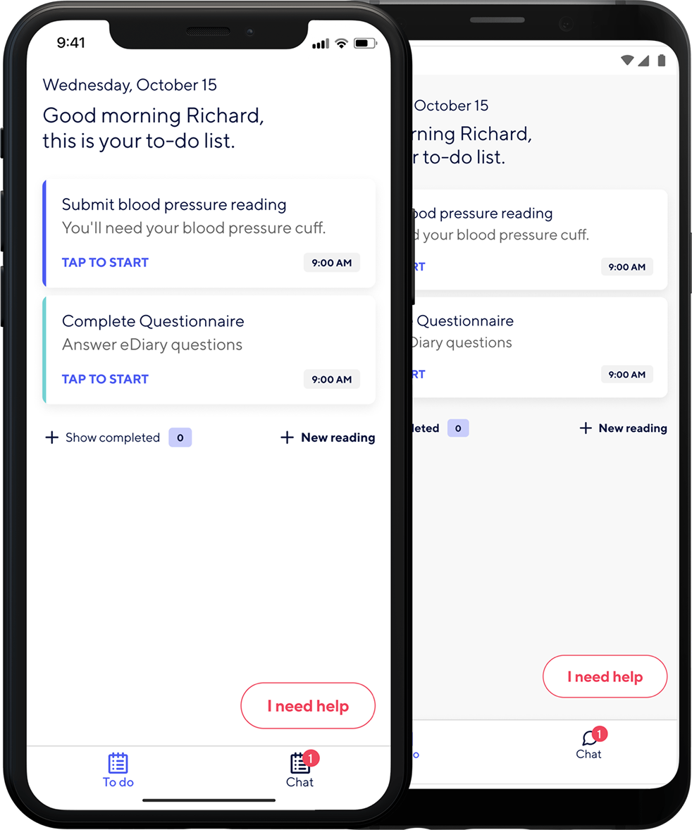
One step, one instruction, one action at a time
1 — Structuring device connection as a state-driven flow
I redesigned the connection journey around a simple principle: one instruction, one action, one step at a time. Each screen focused the user on a single task. Progress was explicit throughout, helping people understand where they were in the setup process and what came next. This reduced overwhelm and lowered the cognitive load for users with less technical confidence.
2 — Designing for waiting and uncertainty
A large part of the connection flow involved moments where the system, not the user, was doing the work. Instead of generic spinners, I designed waiting states that communicated what the system was doing and what the user should expect. This helped users distinguish between normal delay and a potential problem, and reduced the chance of them abandoning or repeating actions unnecessarily.
3 — Making error recovery clear and human
Error handling was redesigned with equal care to the primary flow. Each error state explained what had happened in plain language and gave the user a specific next step. This was important both for usability and for confidence. In a health setting, confusion can easily become anxiety.
4 — Treating accessibility as a core design input
The broad user range made accessibility a design constraint from the start. Touch targets, text size, contrast, and component behaviour were all shaped around making the experience usable for people across a wide range of abilities and confidence levels. This work helped establish an accessibility benchmark for the product that continued beyond the initial redesign.
Pacing as an interaction principle
The strongest interaction principle in this project was pacing. Each step was intentionally simple, and the system did more of the explanatory work. Progress indicators helped users build confidence. Waiting states replaced generic uncertainty with meaningful feedback. Error messages were designed not just to indicate failure, but to support recovery clearly and calmly.
The design aimed to make the product feel dependable in moments where users were often uncertain, tired, or unwell.
A more usable product and a lasting standard
Following the redesign of core connection and monitoring flows, daily active usage increased by 10%. An accessibility benchmark established during the work was adopted as a broader product standard.
Beyond the metrics, the project created a clearer collaboration model between design and clinical stakeholders, helping ensure that usability and medical accuracy informed each other earlier in the process.
What I learned
What worked best was the discipline of the one-instruction-per-screen principle. It sounds simple, but it created a much more usable and confidence-building experience for a broad user base.
If I were improving the process, I would define accessibility standards earlier in the product lifecycle so they shaped all work from the outset rather than being formalised mid-project.
The main lesson from this project was that high-stakes products need more than simplified interfaces. They need interaction design that makes uncertainty manageable.