An Post —
Digital Stamp
A feature request for multi-buy postage exposed deeper usability and navigation issues. I made the case to fix the foundation first, then designed a clearer transaction flow that could properly support the new feature.
A feature request that revealed a bigger problem
The Digital Stamp feature allowed users to purchase postage directly within the An Post app. A request was made to introduce multi-buy, enabling users to buy multiple stamps in one transaction.
At first glance, this looked like a straightforward feature addition. In practice, it exposed a more fundamental issue: the existing purchase experience was already difficult to navigate, unclear in places, and too fragile to support added complexity well. Rather than layer a new interaction onto a weak foundation, I reframed the problem around the quality of the purchase flow itself.
The project became an example of something I care about deeply in product design: not just shipping requested features, but improving the underlying experience so those features can succeed.
Friction at multiple points in the original flow
The path to purchase was longer than it needed to be, and the navigation made it harder than necessary to find the feature and move into the transaction flow. Once inside the experience, the purchase journey contained unnecessary steps and weak system feedback. Pricing was not always surfaced at the right moment, and the confirmation state lacked the clarity needed for a financial transaction, leaving users uncertain about whether the purchase had completed successfully.
Adding multi-buy directly into this context would have increased the cognitive load rather than reduced it. A quantity selector layered on top of an already confusing flow would have made the interaction heavier, not better.
Lead Product Designer
I led the design work on the feature, but a key part of my role was first redefining the problem. Rather than treating the request as "add multi-buy," I made the case that the product needed a clearer purchase flow before it needed additional functionality. Once that was agreed, I led the redesign of the navigation, the transaction flow, and the final multi-buy interaction.
Fix the foundation, then build the feature
1 — Simplifying access to the feature
The first step was improving the route into the purchase experience. I reduced unnecessary decision points and clarified the entry into the Digital Stamp journey so users could move into the purchase flow more directly.
2 — Restructuring the transaction flow around clear states
I redesigned the purchase experience around a small number of clear stages: selection, confirmation, and success. Each step had a distinct role and a clear interaction outcome. This made the flow easier to understand and removed ambiguity around progression — instead of asking users to keep multiple questions in mind at once, the interface focused attention on the one decision that mattered at each point.
3 — Improving system feedback
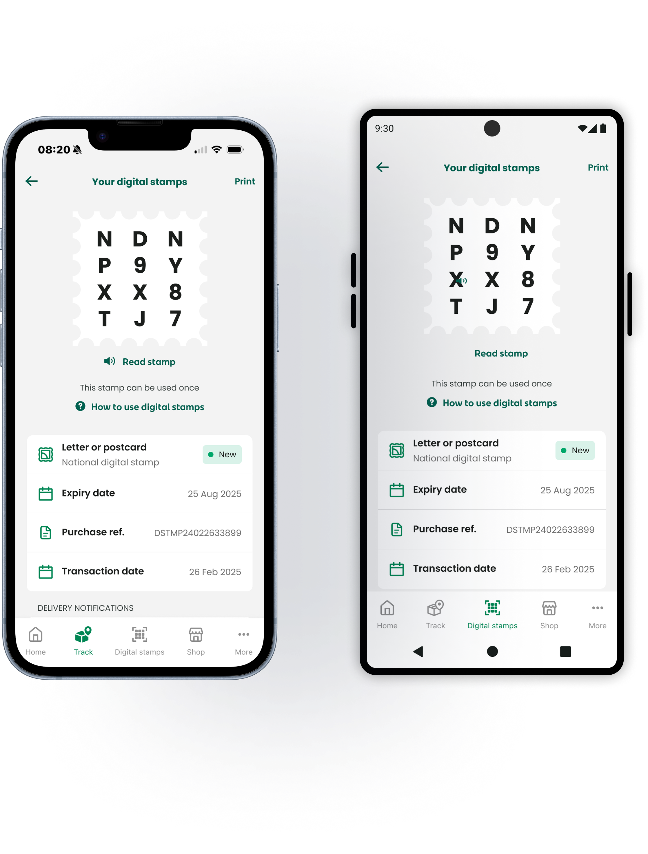
Transaction experiences live or die on feedback. I redesigned the confirmation and success states so the product gave immediate, explicit feedback. Users could clearly see what had been purchased, what they had paid, and that the transaction had completed successfully. This made the overall experience feel more trustworthy and reduced the uncertainty present in the previous version.
4 — Designing multi-buy as a natural extension
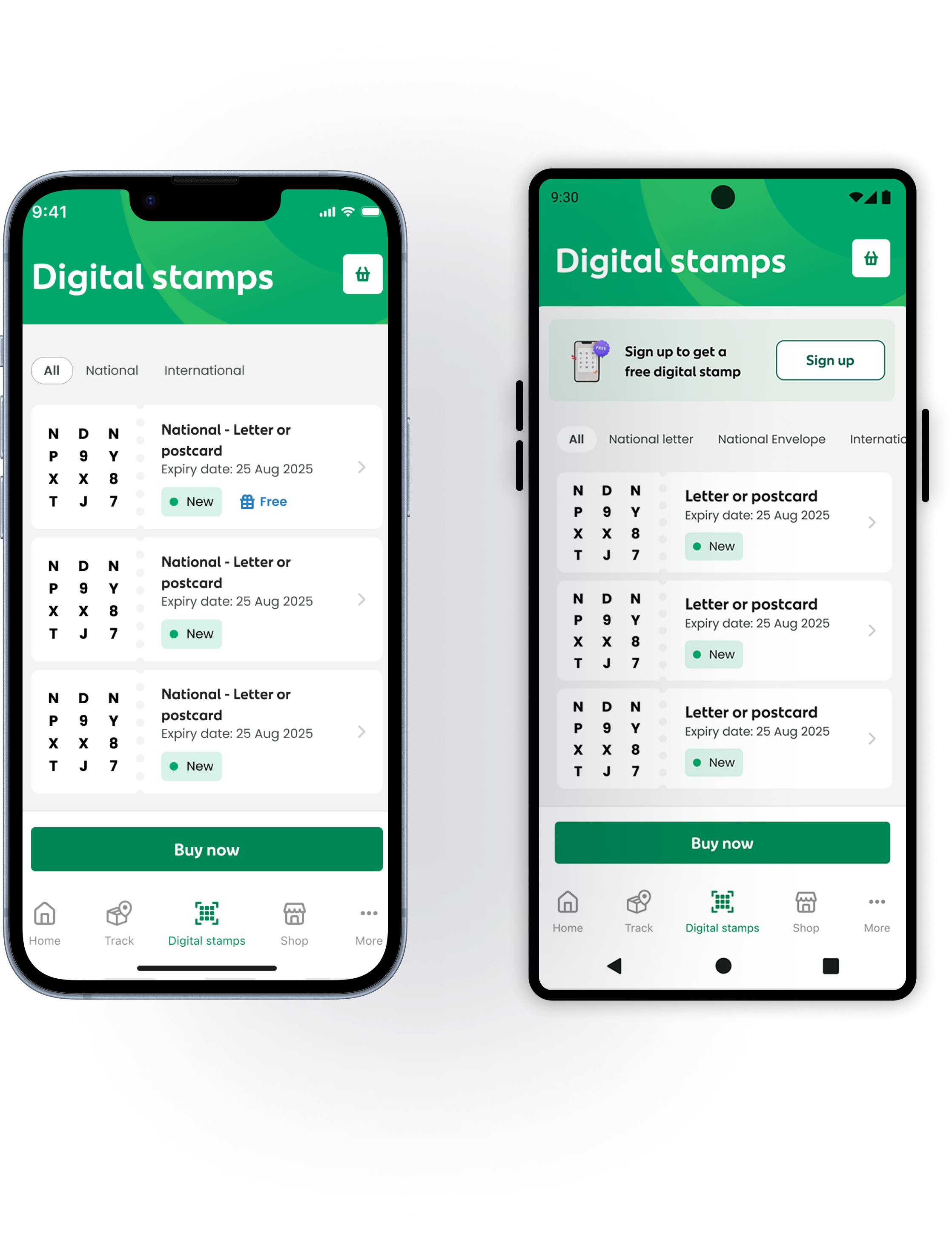
Once the underlying flow was clearer, the multi-buy interaction became straightforward to introduce. The quantity selector was designed as part of the core purchase interaction rather than as an add-on. As users adjusted quantity, the price updated in real time and the order summary reflected the current selection clearly. This kept the interaction transparent and reduced the likelihood of mistakes.
5 — Bringing accessibility up to baseline
As part of the redesign, I also improved the accessibility quality of the experience. Touch targets, form behaviours, and contrast were brought in line with WCAG AA expectations. For me, this was not an enhancement layer — it was part of what it means to produce a complete, production-ready interaction.
Reducing ambiguity across the full transaction flow
The strength of the redesign came from reducing ambiguity across the full transaction flow. Each step communicated its purpose clearly, and users always knew where they were, what they were confirming, and what would happen next. Feedback was immediate and explicit, which mattered particularly in the purchase confirmation stage. Rather than relying on subtle changes or secondary cues, the success state gave a clear signal that the task was complete.
The multi-buy interaction was designed to feel controlled and understandable. Users could see the impact of quantity changes instantly, reducing the chance of confusion before purchase.
What I learned
What worked best was making the case to improve the foundation rather than blindly implement the requested feature. Once that shift happened, the design work had a much clearer direction and the final feature sat naturally within a stronger product flow.
If I were extending the work further, I would look more broadly at navigation patterns beyond the Digital Stamp section. Some of the friction I encountered was not unique to this feature, but part of larger app-level behaviour.
The biggest lesson from this project was that feature requests often reveal structural issues. Sometimes the right design response is not to build the requested thing first, but to create the conditions that let it work properly.